




5 Easy Fall Home Decor Ideas for a Cozy Seasonal Refresh

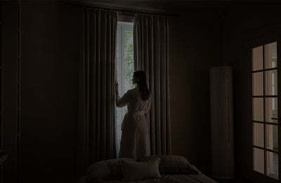
Pictured: Aurelia Collection-Beige Brown-Unlined
Autumn is a perfect season to rethink your home’s color palette. White, light gray and cool blue-green, which are common in summer, can gradually be complemented by warmer and darker colors. But an autumn refresh doesn’t mean changing everything at home to orange or brown.
For truly long-lasting changes, you usually only need to adjust a few key details: change a color, add a little pattern, update window treatments, and then connect the whole space with different materials.
1. Change one main color first, instead of repainting the walls

Pictured: Luma Collection-Oak Dim Gray-Unlined
Loom Collection-Grass Beige-Unlined
If you want to make the space look new in autumn, the wall is one of the most worthwhile places to try.
You might as well choose wallpaper with an obvious autumn atmosphere, such as vintage florals, botanical patterns, plaid or patterns with natural elements. Colors can also be bolder — caramel, olive green, terracotta, burgundy or dark brown, which can bring a stronger sense of season to the space.
You don’t have to cover the whole room. Choosing an accent wall, or only using it in small areas such as dining rooms, reading corners and entryways, can create very obvious visual changes.
If the wallpaper itself has rich patterns, other furniture and soft furnishings can be kept as simple as possible, so that the wall becomes the focal point of the room.
2. Don’t be afraid to use prints: start with a small area


Pictured: Morrey Collection-Brown-Privacy Lining
Autumn is very suitable for adding prints, but using prints over a large area can easily make the space look messy.
If the living room is relatively simple, you can start with an accent chair, a pair of throw pillows or a small rug. Traditional botanical patterns, plaid, fine stripes and small geometric patterns are very suitable for autumn and winter.
If you want to use prints on window treatments, you can consider botanical patterns or vintage floral curtains. For the bedroom or reading corner, a printed Roman shade is also a good choice — it is more restrained than full-window printed curtains, but it is enough to be the focal point.
There is a simple matching principle: don’t have more than 2–3 obvious patterns in the same space, and try to let them share the same color.
In this way, even if the patterns are different, they will look like they have been designed, instead of being stacked together randomly.
3. Add an “autumn hero piece” to your soft furnishings

Pictured: Luma Collection-Oak Dim Gray-Blackout Lining
Birch Collection-Reddish Brown-Unlined
After the walls and window treatments are confirmed, there is no need to continue to add a lot of decor.
It is enough to choose one or a set of soft furnishings as the autumn hero piece — for example, a caramel-colored accent chair, a dark throw, a set of autumn-toned throw pillows, or a small rug with a vintage pattern.
If the space itself has obvious patterns, you can choose solid-colored soft furnishings; if the furniture and walls are relatively simple, you can use plaid, stripes, florals and other patterns to add visual depth.
The focus is on highlighting only one area. For example, there is already an obvious autumn-style throw pillow on the bed, so there is no need to let the rug, accent chair and bedding compete for the focal point at the same time.
4. Replace the blind pursuit of warm colors with a “contrast”

Pictured: Morrey Collection-Brown-Unlined
An autumn space is not necessarily better the warmer it gets.
If everything is beige, cream and light brown, it is easy to lose the focal point. A more sophisticated approach is to add a little dark color to establish a contrast.
For example, pair beige sofas with dark brown curtains, light bedrooms with dark green Roman shades, and light-wood dining rooms with black light fixtures and dark dining chairs. The same idea works in the bathroom. Light-colored walls or tiles paired with wood-tone bathroom vanities, black or brass hardware, or dark wallpaper can make the originally cool and simple space feel more autumnal.
If you are not sure whether the dark color is suitable for you, you can start with window treatments. Curtains or a Roman shade is cheaper than replacing large furniture such as sofas and rugs, and it is also easier to adjust next season.
The key is not “the more dark tones, the more sophisticated”, but to have a clear proportional relationship between the shades.
5. Finally, do one round of “subtraction”

Pictured: Lois Collection-Beige L03-Unlined
After completing the main adjustments, walk around the room to see what details still have a clear sense of summer. For example, overly thin throw pillows, cool-to-the-touch bedding, curtains with no texture at all, and too much bright-white decor.
There is no need to replace everything. You can replace some lightweight throw pillows with velvet or knitted pieces, pair the white sofa with a dark throw, or add a layer of textured fabric by the window.
The focus of an autumn refresh is not to add more things, but to replace a few pieces that no longer match the season.
For autumn home decor, changing a few key elements is enough
There is no need to redecorate, and there is no need to buy a whole set of new furniture according to the season.
Start with a color, a print, a window treatment or several materials, and keep the changes focused on the places that really affect the space.
A good autumn refresh is to let your home keep its own style as autumn and winter arrive, while simply adding a touch of unique warmth.
Laisser un commentaire
Tous les commentaires sont modérés avant publication.