


Cave or Cocoon? How to Choose the Right Curtains for Dark Walls
So, you felt brave. You stood in the paint aisle, ignored the safe "Off-White" chips, and chose something bold. Maybe it was "Midnight Navy," "Forest Green," or a deep, moody "Charcoal."
You painted the walls. You stepped back to admire your work. And then… the panic set in. Instead of looking like the cozy, moody Pinterest board you envisioned, the room feels small. It feels heavy. It feels a little bit like a cave.
Take a deep breath. You didn't make a mistake. You just aren't finished yet.
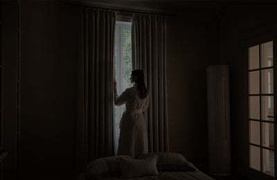
A dark wall is like a beautiful evening gown; it needs the right jewelry to make it shine. In interior design, your curtains are that jewelry. They are the "Light Valve" of the room. The right curtains decide whether your dark room feels like a dark dungeon (bad) or a luxurious, safe cocoon (good).
If you are staring at your dark walls wondering how to fix them, this guide is for you. Here is how to master the "Moody Interior" trend without losing the light.
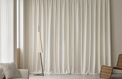
Strategy 1: The "Color Drench" (The Bold Move)
Best for: Bedrooms, Media Rooms, and spaces where you want a "hug."
There is a reason luxury boutique hotels often feel so immersive and relaxing. They use a technique called "Color Drenching."
The Concept: Don't break the visual line. If your walls are Navy Blue, choose Navy Blue curtains. If your walls are Forest Green, go for Emerald drapes.
Why It Works: When the curtains match the walls, the boundaries of the room disappear. Your eye doesn't stop at the window frame; it continues seamlessly around the space. This is a magic trick for low ceilings—it makes the room look infinite, like looking up at the night sky. Instead of feeling "closed in," the room feels like a warm embrace. It wraps around you.
The "Texture" Secret: Here is the trap: If you put a flat cotton curtain next to flat matte paint, the room will look like a cardboard box. You need Texture Contrast.
-
The Fix: If the wall is matte, the curtain must shine.
-
Our Hero: This is where Frankie (Velvet) shines—literally. The slight sheen of velvet catches the light, adding depth and life to the darkness. It creates a subtle separation that screams luxury.
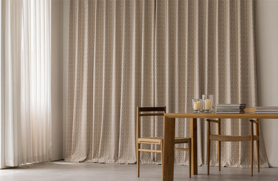
Strategy 2: The "Texture" Imperative (Visual Weight)
Even if you don't match the color, you must respect the Physics of the Room.
Dark paint has "Visual Weight." It looks heavy, grounded, and substantial. If you hang a thin, flimsy, unlined curtain next to a charcoal wall, it will look cheap. It’s like wearing flip-flops with a tuxedo. The curtain looks weak because it can't stand up to the power of the paint.
The Rule: Go Heavy or Go Home. For moody interiors, you need High-GSM (Grams per Square Meter) fabrics.
-
Velvet (Frankie): The absolute gold standard for dark walls. It anchors the window.
-
Heavy Chenille or Jacquard (Maribel): Adds a tactile quality that makes you want to touch the walls.

At Three Girls, our curtains are weighty and substantial. When you pull them closed, they seal the room, creating that sanctuary feeling that every mom needs at the end of a chaotic day.
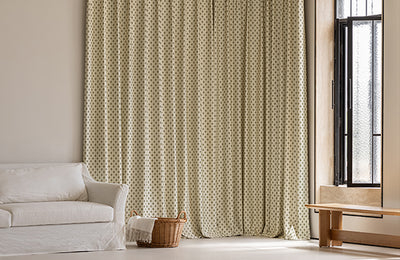
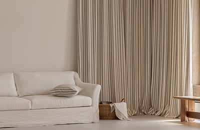
Strategy 3: The "High Contrast" Pop (The Light Seeker)
Best for: Living Rooms and spaces with small windows.
Maybe "Color Drenching" feels too intense for you. Maybe you want to celebrate the darkness of the walls but still keep the room feeling airy. In this case, treat your curtains as a "Second Window."
The Concept: By hanging light-colored curtains against a dark wall, you create a high-contrast focal point. The fabric reflects light, tricking the eye into thinking the room is brighter than it is.
The Perfect Pairings (Steal These Recipes):
-
The Classic Luxury: Dark Navy Walls + Mustard Gold (Velvet). This is regal, timeless, and feels like a library in an old estate.
-
The Modern Architect: Charcoal/Black Walls + Crisp White (Delphine/Motti). This is high-energy and graphic. It looks sharp and intentional.
-
The Organic Calm: Forest Green Walls + Oatmeal/Beige (Zen/Coto). This brings the "outside in." It feels like a cabin in the woods—grounded, natural, and peaceful.

A Warning on "White": Be careful with "Stark White." If your dark wall has warm undertones (like a Chocolate Brown or a warm Terracotta), a bright white curtain will look blue and clinical. Instead, choose a creamy Ivory or Natural Linen to keep the warmth alive.
Strategy 4: The "Metallic" Rule (Warm Up the Shadows)
Here is a bit of science: Dark walls eat light. Light walls reflect sunshine; dark walls absorb it. This is why dark rooms can feel "dead" if you aren't careful.
To fix this, you need fabrics that bring their own energy. Avoid flat, cool greys, which can make a dark room feel like a cave on a rainy day. Instead, look for curtains with Warm Undertones—hints of Gold, Bronze, Copper, or Cream.
-
Maribel (Jacquard): The woven patterns in this collection catch the light from your lamps, adding a "twinkle" to the room that breaks up the solid darkness.
-
Frankie (Gold or Rust): These colors act like candlelight. Even during the day, they add a glow to the room that counteracts the shadows.
Conclusion: Trust the Drama
Painting a room a dark color is a commitment. It’s a bold statement that says, "I want to feel something when I’m in this room."
Don't let fear make you backtrack with boring curtains. Your curtains should honor that boldness. Whether you choose to wrap the room in a velvet monochrome hug or create a striking contrast with natural linen, remember that the goal isn't to make the room look "bigger"—it's to make it feel better.
Still afraid of the dark? Don't guess in the shadows. Order 5 free swatches from Three Girls today. Tape them up against your new moody walls, watch how they catch the lamp light in the evening, and find the perfect partner for your brave new color.
Leave a comment
All comments are moderated before being published.