


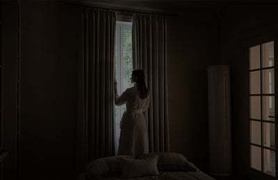


5 Curtain Styling Tips to Make Your Living Room Feel Softer This Fall

Pictured: Rosie Collection-Beige-Blackout Lining
Want to make the living room feel a little fall-inspired, but don’t want to buy a bunch of “seasonal decorations” that can only be used for a few months?
Starting from the curtains may be the easiest way. Choose the right color, fabric and installation method, and a few small changes can immediately make the whole space warmer and more layered.
If you are considering changing curtains for fall, you can start from the following 5 details.
Tip 1 | Solid-color curtains: start with low-saturation colors

Pictured: Luma Collection-Khaki Yellow-Unlined
If you want curtains that will look good for years to come, solid colors are usually your best bet. For fall, skip stark whites and overly bold, saturated shades in favor of softer, more muted tones like oatmeal, warm taupe, light camel, warm gray, or dusty blue.
When choosing a certain color, observe the colors already in your living room: you can pull a shade from the rug, sofa, wooden floor or wall as a reference, and then let the curtains be half a shade to one shade deeper than it. The space will be more layered, instead of all the colors “floating” together.
Fabric matters just as much. Cotton and linen are suitable for spaces that call for natural textures; matte chenille or thicker fabrics have more drape. Instead of pursuing a particularly heavy “fall and winter feeling”, it is better to choose fabrics with weight but not too shiny on the surface, which look soft during the day and more calm at night.
Tip 2 | Printed curtains: small-scale patterns stands the test of time


Pictured: Morrey Collection-Brown-Unlined
You like a little change, but you’re worried that the print is too eye-catching. You can choose a low-contrast and small-scale pattern.
Delicated branches and leaves, abstract plant patterns, fine-line geometric patterns, and soft plaid patterns are easier to integrate into the daily living room than large-scale florals. A good rule of thumb is to keep the pattern colors close to the curtain’s base color, with no more than one or two darker accent shades.
For example, a beige background with light brown branches and leaves, or a light khaki background with gray-green patterns. Such curtains have details up close, and they are still close to a pure color from a distance, which will not make the whole wall look crowded.
If the living room itself already has a patterned rug, wall art or patterned sofas, keep the curtain print more understated. On the contrary, if the furniture is mainly solid-colored, an understated printed curtain can become the right focal point of the space.
Tip 3 | Solid curtains with a narrow trim: an easy way to get a custom look

Pictured: Lucy Collection-Light Khaki-Blackout
If you don’t like prints and solid curtains feel a little too plain, consider adding a decorative trim.
This is a detail that is suitable for long-term use. Keep the main fabric in a solid color, and add a narrow decorative edge. It will not change the overall look, but it will give them a more costum, thoughtfully designed feel.
The most foolproof option is tonal edging, such as oatmeal with darker coffee; if the space itself is relatively simple, you can also try dark brown, charcoal gray or a thin black edge.
It is recommended to control the edge width within a narrow range, especially when the living room area is not large. The vertical single-sided edging can emphasize the height of the curtain; a border on all four sides has the refined look of traditional custom-made curtains.
The key is not “the more decoration, the more high-end”. It's to choose a trim design that picks up on a certain shade in the furniture, lighting or other soft furnishings.
Tip 4 | Add a pelmet: solve the mess and light leakage at the top first

Pictured: Zaria Collection- Brown-Privacy Lining
Many curtains look less polished than they could, and the problem isn’t always the fabric.Sometime, it comes down to the installation details.
If the curtain track, hooks and pleats are all exposed, they can easily look visually cluttered. If your setup allows, consider adding a cornice or valance to hide the track and let the curtains fall naturally from the position closer to the ceiling.
This not only improves the appearance, but also reduces the light leakage at the top. Especially in a living room that needs strong light-blocking, a well-fitted cornice/valance is more effective than simply increasing the thickness of the fabric.
The cornice/valance doesn’t need to be very wide. Modern spaces are more suitable for simple and narrow-edged designs. The color should be as close as possible to the wall or ceiling, and visually take a step back, so that the curtains become the real main feature.
Tip 5 | Add textural layers with shades

Pictured: Rosie Collection-Beige-Privacy Lining
Lois Collection-Beige L03-Unlined
If you don’t want to use only traditional fabric curtains, try pairing them with bamboo shades or Roman shades. Curtains soften the light and create a soft atmosphere, while shades add natural texture and offer a tailored look.
Fabric curtains paired with natural bamboo shades work beautifully in living rooms with warm wood tones, organic textures. For modern and minimalist spaces, simple Roman shades are a better fit. The color doesn’t have to be complicated. Fabric curtains in oatmeal, light camel or warm gray can be matched with a natural bamboo color or Roman shades of the same color.
Finally
Changing curtains in fall does not necessarily mean turning the living room into an “fall theme space”.
Lasting changes often come from softer colors, more textured fabrics, and carefully finished edges, tracks and layers. By choosing solid colors, low-contrast prints and trim borders, together with a pelmet and a double-layer structure, you can make the light and atmosphere of the living room naturally enter fall without changing the furniture.
Leave a comment
All comments are moderated before being published.